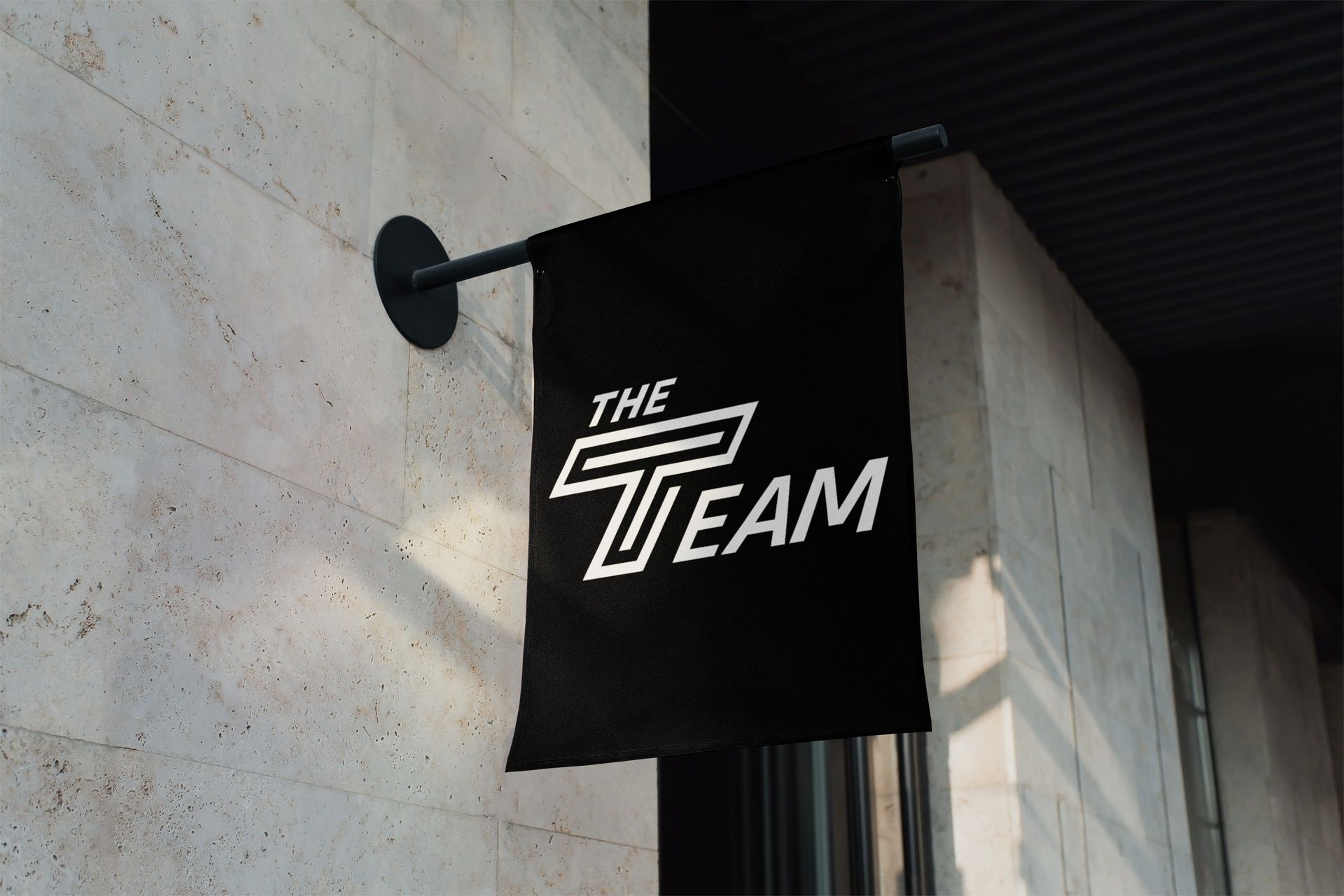
The Team. Rebranded.

We are thrilled to unveil The Team’s new brand identity and logo! We’re making these branding changes to reflect our expanding vision and broad partner appeal, while maintaining a flexible and fresh look. We spoke with athletes, coaches, administrators, and partners to hear their reactions to our vision for the future of our movement. With invaluable advice and input from both the civic and athletic communities, we have expanded our vision for the possibilities of what The Team can be.
We followed our design philosophy in this process by designing for and with student athletes and coaches. The logo centers around a dynamic “T” icon that symbolizes our commitment to offering a pathway for every athlete, coach, and administrator to become more engaged citizens. As part of the rebrand, we are also changing our color scheme to black and white. The new colors reflect our dynamic and forward-moving mission as well as our bold but neutral point of view.
This is a paragraph. Writing in paragraphs lets visitors find what they are looking for quickly and easily.
This is a paragraph. Writing in paragraphs lets visitors find what they are looking for quickly and easily.
This is a paragraph. Writing in paragraphs lets visitors find what they are looking for quickly and easily.
This is a paragraph. Writing in paragraphs lets visitors find what they are looking for quickly and easily.
The T within the T shows that all the work and programs fall under the umbrella of The Team. It fits perfectly with our new direction.
CALEB KENNEY, HOLY CROSS MEN'S BASKETBALL
I love The Team’s decision to shift to black and white! It so aptly reminds me of a referee, who also represents a neutral, nonpartisan force.
ELIZABETH FORD, PENN
WOMEN'S VOLLEYBALL
The logo is bold and forward-moving, just like the mission of The Team. It shows that we are offering a pathway towards a better future.
JOE KENNEDY, EXECUTIVE DIRECTOR, THE TEAM
Why Black & White?
01
It's focused and clear.
Black & white is official, sleek, connected, forward-facing, and shows that we are making an impact.
02
Unites us around a common goal.
There are endless rivalries around schools and brands, but no athlete will ever object to wearing black & white.
03
Portrays
neutrality.
We are nonpartisan and impartial, such as a referee. We are focused on spreading joy around civic engagement.
04
Allows our athletes to shine.
If we can make images the focal point, it is highlighting the athletes and brands we are working with.


